MOVIE MAPPER - Google UX Design Certificate
A personal UX design project with the objective of designing a simple cinema app for users within a big city.
-
Project Type
Personal project - Google UX Design Certificate.
-
Project Date & Duration
June 2021 - October 2021.
-
My Roles
UX Researcher, UX Designer.
User interviews, Empathy Mapping, User Journey Mapping, Personas, Information Architecture, Wireframing, Prototyping, Usability Testing.
Project Summary
Movie Mapper is a cinema ticket booking app that allows users to browse films, compare showtimes of multiple different cinema chains and buy tickets all in one place.
The app is designed to make booking cinema tickets effortless for users whilst improving the overall cinema experience for big city cinema goers.
From empathising with users during research to prototyping and testing design ideas the project itself involves all stages of the Design Thinking process as part of the Google UX Design Certificate.
The objective being to design a mobile app for cinema goers in a big city by utilising key UX design and research skills.
The challenge
With a substantial number of movie theatre apps available in the UK market, the challenge as a part of the foundational research was to determine what problem the product should aim to solve.
The two goals of the foundational research were:
To identify common challenges users might face during the cinema experience.
To identify what part of the cinema experience an app could improve.
User research
As part of the Empathise stage of the design thinking process, I conducted remote and face-to-face interviews with users who identify as cinema goers and live in a big city.
Pain points
The research confirmed initial assumptions of common user pain points within the cinema experience but the research also revealed that big city users tend not to be loyal to one cinema and would benefit from information on multiple cinema locations.
-

Ticketing
Users find that online tickets are not seamless with the in cinema experience.
-

Seating
Seats are important to users, they are frustrated when they don’t get their favourite seats or the view is poor.
-

Value for money
Users find the cinema an expensive experience, because of this they want deals, offers or app incentives.
-

Busy Showings
Users get frustrated when cinemas are too busy, they’d like to know more about how busy a showing will be so they can decide if that suits their needs.
-

Mid-performance issues
Users are irritated by aspects that ruin the performance for them e.g. noise, bad views & Covid-19 concerns.
-

Only one cinema
Big city users are frustrated by having information on only one cinema. They wish they could find out about multiple cinemas in one place.
Empathy Maps & personas
To better understand each user I created empathy maps and from this was able to identify two distinct user groups from the research.
Group 1 are film enthusiasts that go to the cinema often because they enjoy the big-screen experience - the persona ‘Finn’ was based on this group.
For group 2 the cinema is an enjoyable part of a larger social event (like a date night or day out with kids) rather than just for going to watch a film - the persona ‘Mila’ was based on this user group.
Defining the problem
By creating personas, crafting user stories and mapping user journeys I was able to define a problem statement for each persona and reveal key user goals which highlighted opportunities for the product to improve in the final design.
User journey map for ‘Finn’
And to consider how the product might alleviate these problems, these two hypothesis statements were formed:
We believe that a multi cinema location option within the app will make it easier for ‘Finn’ to plan & book his tickets in advance.
We believe that app features that focus on improving the in-cinema experience will mean ‘Mila’ can spend more time focusing on the people she goes with.
ideation
After empathising with users and defining the design problem the next steps were to generate solutions and enter the ideation stage.
Asking ‘How Might We’ questions helped to reframe problems into potential solutions and spark design ideas.
And using these to undertake the ‘Crazy Eights’ design ideation exercise helped to form several design ideas in a short space of time.
User flows, storyboards & information architecture
To anticipate user needs when interacting with the product, user flows and storyboards were created.
-

User flows
User flows helped picture how users will move through the app.
-

Storyboards
Storyboards were used to visualise and explore how users might experience the product.
-

Information architecture
Following on from this, information architecture was outlined to consider the overall structure of the product ahead of prototyping stages.
WIREFRAMES
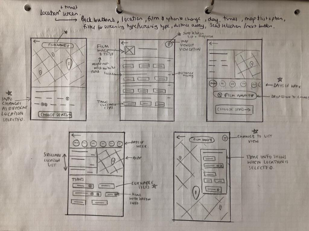
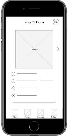
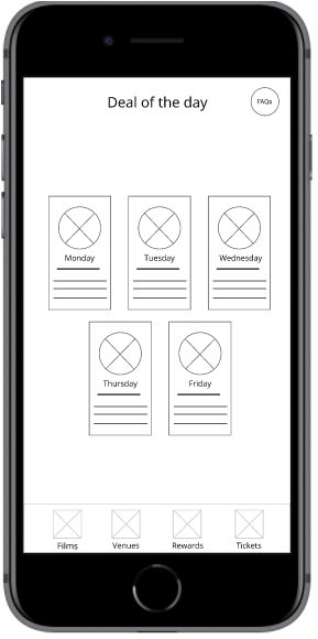
As a part of the ideation process drafting iterations of each screen helped ensure elements included were well-suited to address user pain points.
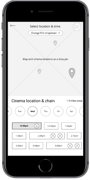
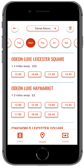
When designing the ticket booking process, the focus was on ensuring users could compare different cinema locations easily within the app.
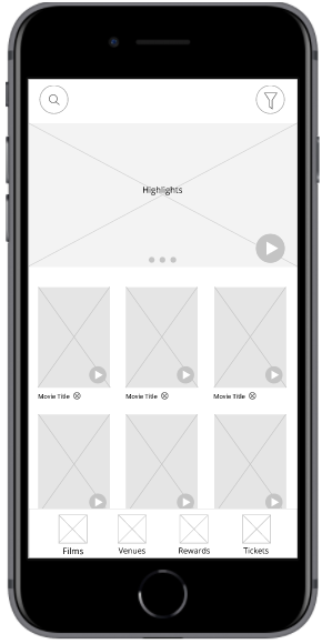
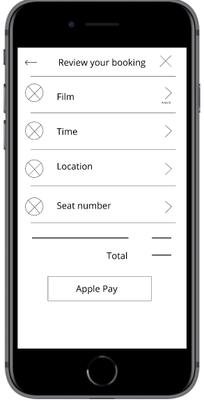
Once paper versions were refined, digital wireframes were created for each page.



Low-fidelity prototyping
A low-fidelity prototype was created using Figma and connected the primary user flow of finding and booking tickets within the app.
The interactive prototype created was used to test early concepts of the design within moderated usability studies.
TESTING EARLY CONCEPTS
After wireframing & prototyping, the next step was to test the design with target users.
Two rounds of usability studies were conducted.
Insights from initial rounds helped guide the designs from wireframes to mockups and also gathered evidence to support early design decisions.
"When I click films, I lose the bottom tray, which I find uncomfortable"
Participant A - Round 1 Study
Round 1 usability studies revealed that the navigation was not showing as expected on certain screens of the app for some users.
To improve the users understanding of how to navigate through their journey the navigation bar was added to more pages of the user flow.
“Personally I find maps harder to read, so I prefer looking at the list ”
Participant E - Round 1 Study
A list view version of the map screen was added in early designs to support those with accessibility needs and those using screen readers.
Findings from the first round of testing supported the decision to include this page as some participants preferred the list view to compare locations.
The list view became a key page included in the mockups.
Testing High-Fidelity designs
The second round of testing used a high fidelity prototype and revealed what aspects needed refining in the mockups.
The key finding from the second usability study revealed frustrations with the map feature.
"There's lots of icons I don't care about... I just want to know where the cinemas are"
Participant 1 - Round 2 Study
To make interaction with the map more intuitive for users the visual design of the map was simplified, a current location marker was added and the number of icons was reduced so only cinema locations were showing.
Mockups



design System
A design system was created to help increase the speed of production by making commonly used elements and components standardised, reusable and easily accessible.
Using this design system helped ensure consistency within the design.
Colour contrast in the design system was checked against the Web Content Accessibility Guidelines to ensure designs met accessibility standards.
The Final Design
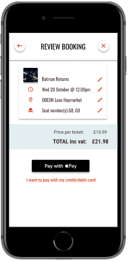
The final high fidelity prototype met user needs by presenting an intuitive user flow to help users to book cinema tickets effortlessly.
"It's so simple there's no clutter, it's just easy, I can click on a film, I see the film, I book the film"
As well as improving on the in-cinema experience by including in-app tickets and food & drinks deals.
“Oooh tap to reveal your in-cinema reward, ooh I like that!"
Key Takeaways
What I’ve learned while designing Movie Mapper, is about the importance of gathering a diverse range of feedback.
Each usability study either supported previous feedback or added something new - all participants brought valuable insights and influenced iterations of the design in significant ways.
If the project were to continue I would conduct a third round of usability testing to further validate that pain points had effectively been addressed within the final versions of the design.


