Enhance - Google UX Design Certificate
A personal design and research project with the intention of creating a responsive website. The final product - a music streaming website - is designed for listening to and ordering the albums created by your favourite musician.
-
Project Type
Personal project - Google UX Design Certificate.
-
Project Date & Duration
November - December 2021
(7 weeks)
-
My roles
UX Researcher & UX Designer
Defining Research, User Interviews, Research Analysis & Synthesis, Design Ideation, Wireframing & Prototyping in Adobe XD & Responsive Website Design.
Project Summary
Enhance is a music streaming website designed to give users more information on the albums created by their favourite musicians.
The website focuses on how users listen to albums rather than playlists, and allows users to explore music videos, lyrics and greater information on the album itself so they can learn more about the meaning behind the music.
This project was a part of the Google UX Design Certificate - an extensive programme designed for developing professional UX design and research skills - and the objective of this project was to utilise these skills to create a responsive website.
The Challenge: The prompt given for this challenge was to ‘design an album listening and ordering flow for your favourite band’.
The Solution: The solution discovered was Enhance - a website designed for the more attentive and focused listening that comes when experiencing a new album for the first time - in particular when listening to the album of a favourite artist.
Research gOALS
To first tackle the challenge research goals were established.
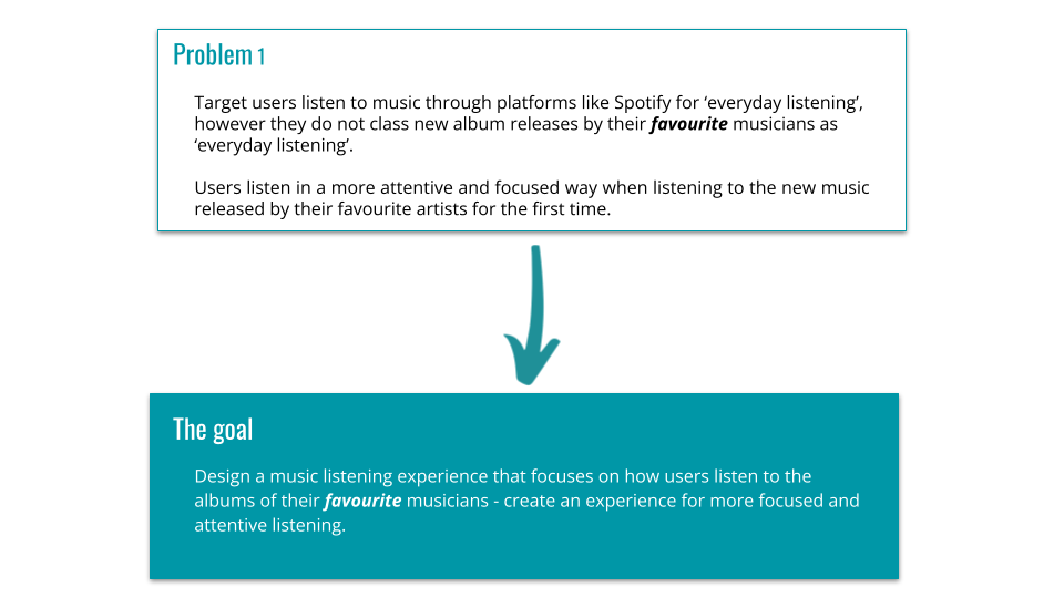
1. To identify common challenges users face when listening to music
2. To understand the frustrations users have when ordering, buying or downloading music
As there are a number of widely used music listening platforms, understanding the problems users face in the ways they currently listen to & order music was key in determining what problem the product could solve.
Understanding the User
Remote interviews were conducted to obtain in-depth qualitative responses regarding the key aspects of the challenge.
To analyse the data collected, aggregated empathy maps were constructed from participant responses, these helped me to better empathise with the target user and form personas.
Pain Points
The research revealed a number of pain points that users had within their current methods of listening to music.
-

Listening Tracking
Users are frustrated that apps they use don’t track their listening history in the way that suits them.
They find that they can’t keep on top of their likes, favourite artists, new album releases and play history easily.
-

Lack of info on their favourite artists
Users like to know as much as they can about their favourite artists music.
They feel their experience is lacking when deeper information on new albums is not included in their current listening journey.
-

Using multiple platforms
Users are frustrated that they have to use different platforms for watching music videos and for listening to music.
-

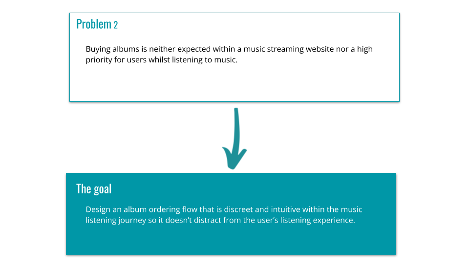
Buying is low priority
Millennial users tend not to buy albums via music streaming platforms.
Buying albums is not an expectation within their music listening journey.
Research Insights
The foundational research identified two problems users have within their current listening and music ordering processes. These problems were used to determine the project goals.
Ideation
Reframing the problem into How Might We questions helped to translate pain points into opportunities for design solutions.
Competitive Audit
By undertaking a competitive audit I was able to identify gaps and opportunities within the market, alongside determining any market standards that might influence the design.
The audit helped to confirm there was room within this space for an enhanced listening experience.
Although some competitors have ventured into creating enhanced listening experiences within their platforms, these are still in their early stages and are not part of a seamless user journey yet.
Creating a Site Map
The research identified that users had difficulties finding the music they had previously listened to, as well as frustrations with being unable to easily navigate to albums rather than individual songs on the current platforms they use.
The information architecture created was designed to make this easier for users as well as integrating an intuitive ordering journey into the website.
Starting the Design
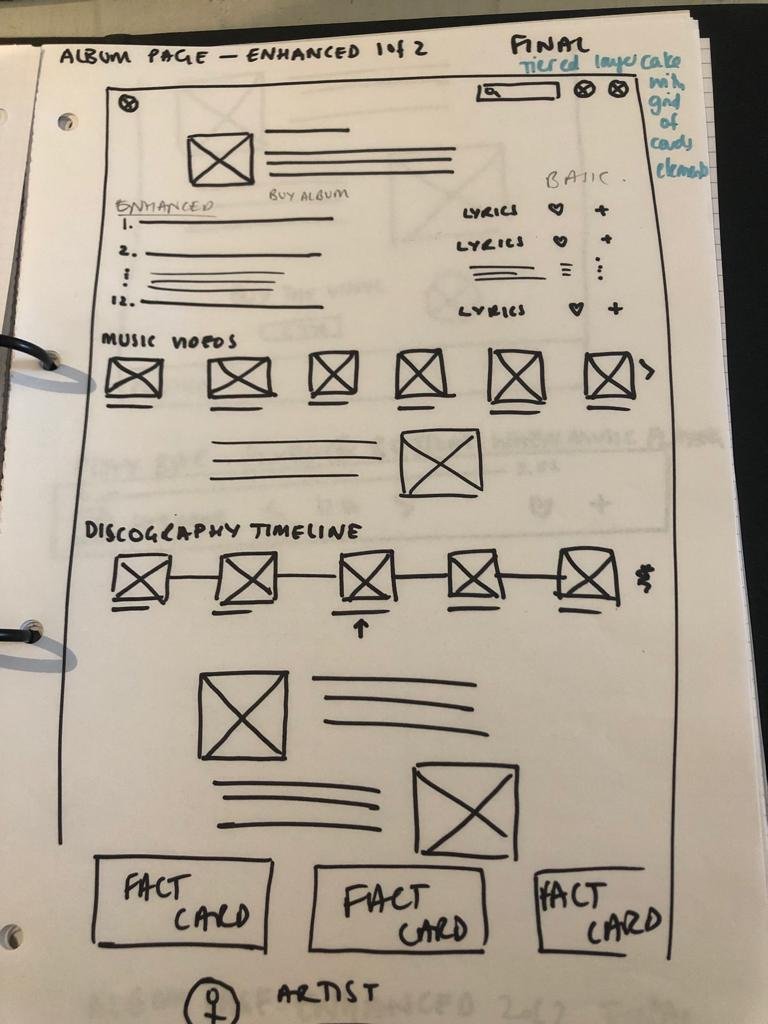
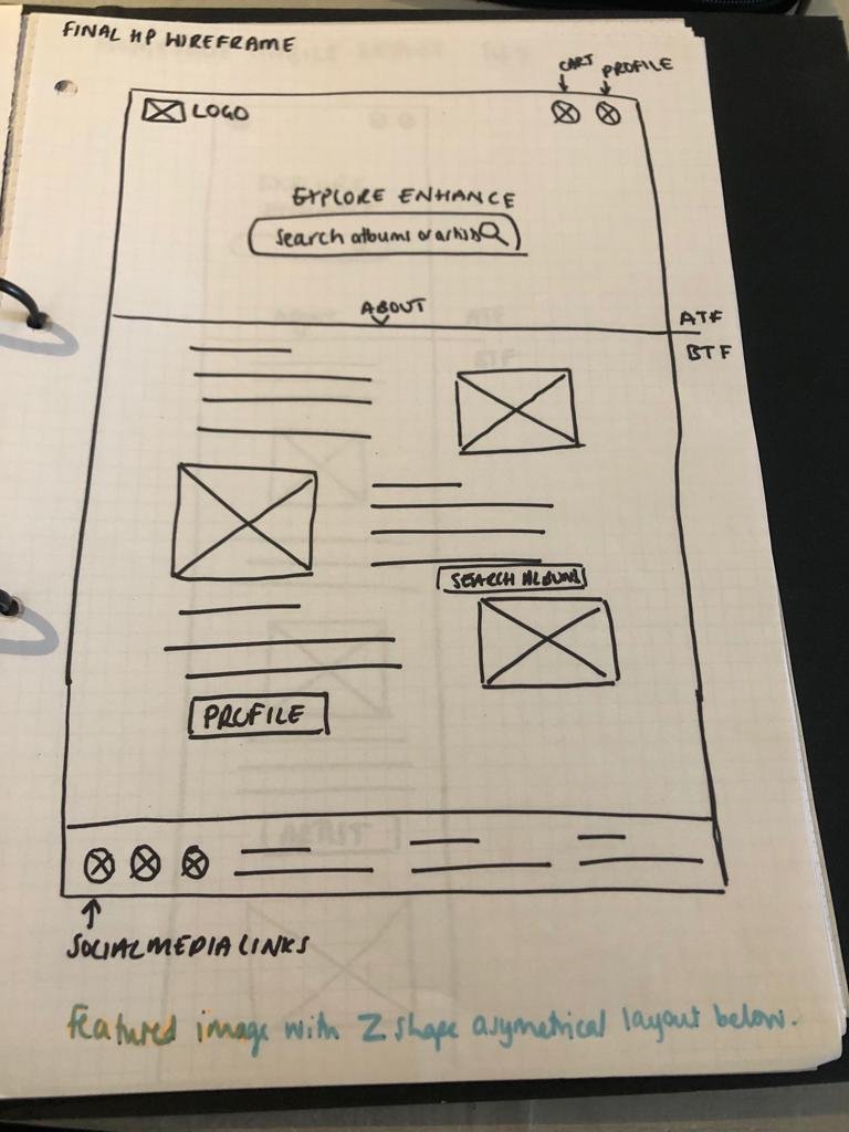
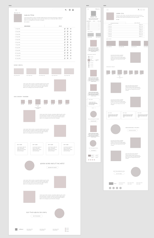
To ensure the design was responsive across devices, I sketched screen size variations of key pages in the user flow early in the design process.
Carousels and vertical layout changes were particularly useful in helping the content to flow intuitively on a mobile device.
Taking this approach meant creation of the digital wireframes within Adobe XD could be more efficient.
Digital Wireframes of the Album Page in Desktop, Mobile and Tablet sizes.
A low-fidelity prototype was then created within Adobe XD to test the primary and secondary user flows with target users.
Flow 1 - Listening to an album
Flow 2 - Ordering an album through the website
Usability Testing
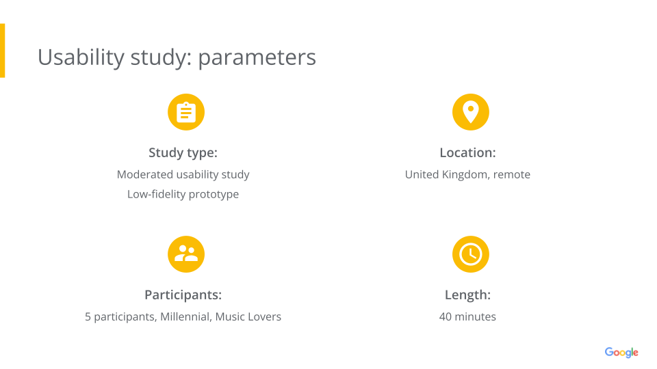
When planning the usability study a number of research questions were established to streamline the direction of the research.
Can users navigate clearly using the search function?
Can users listen to music through the website with ease?
Does the user find the album ordering process easy or difficult?
Are there any parts of the journey where users are getting stuck?
Can users understand and interact with the features on the site easily - including enhanced listening, adding thoughts, and navigation within the listening history.
What can we learn from the user flow?
Refining the Design
Based on findings uncovered in the moderated usability study both the listening and ordering journey were updated to improve usability in later versions of the design.
Update 1 - The listening journey
The ‘basic listening’ and ‘add thoughts’ features were removed from the site.
Updated sitemap with the removal of the basic listening and thoughts pages.
These features were not essential to the main user flow and their function was unclear to users in practice - to streamline the journey these features were removed.
Update 2 - The Ordering Journey
An album type and shipping type dropdown were added to the basket to improve the checkout flow.
These features were identified as missing within the usability study and feedback also showed that users liked the basket being all on one page.
Update 3 - Icons
Icons across the entire prototype needed to be refined to simplify navigation for users and make the journey more intuitive.
Users found playing songs difficult, the addition of a clear play icon in the products branding was created to make this easier for users to interact with.
As a lyrics feature is uncommon in most music streaming websites there was no standardised icon that could be incorporated into the design for lyrics.
To make the design of this icon more intuitive for users, the lyrics icon was refined to include text.
Final Designs
Mockups - External Links

High Fidelity Prototype
High-fidelity prototype created in Adobe XD
Key Takeaways
By considering how users listen to music in different ways, I was able to create an impactful experience that helps users understand more about the music they listen to and feel more connected to the artists they love.
This project has shown me how the design thinking process and particularly UX research can help to identify opportunities in any space - even highly competitive spaces like the music streaming service industry.


